Visualized Hydration Logging
One flower. Three sections. No math required.
- Role
- Product Designer
- Solo
- Deliverables
- Persona, empathy map, journey map, final screens
- Context
- Personal project
- watchOS app
Overview
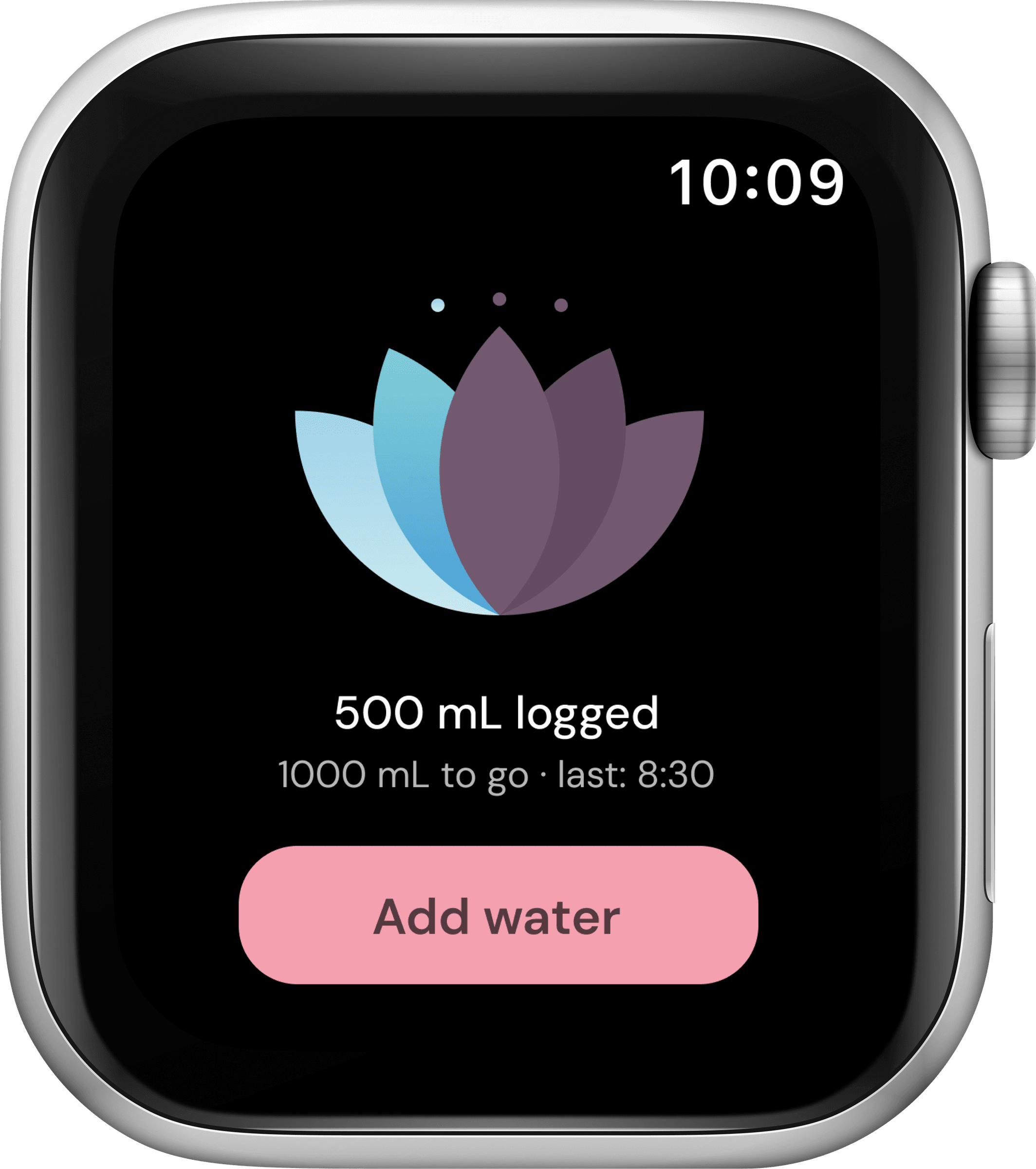
Hanami is a hydration tracker for Apple Watch. The goal was to build its core interaction around a single glance that tells you where you stand, not around a number you have to stop and interpret.
So the real question became how do you make checking in feel informative?
Research synthesis
“I check it a few times a day, but I couldn’t tell you if I’m actually on track.”
Meet Mai

Mai James
The Habitual Checker
- 27
- Environmental Analyst
- Austin, TX
Bio
Wears her Apple Watch daily and has tried more than one hydration app before this. Familiar with the basic idea — a goal, a log, a number — but none of them have stuck. She checks in often, about 4.5 times a week, without ever feeling like she’s caught up on how she’s doing. She’s not new to tracking. She’s tracking without traction.
Personality
Mai
User journey map
Mai’s journey across four stages — tap one to see her tasks, feelings, and where the experience still falls short.
- Opens the app for the first time
- Sets her daily hydration goal
- Confirms and lands on the home screen
Neutral. Mostly wants to get through setup and start using it.
No major issues identified.
A wrist-first experience built for clarity, at a glance.
What I built
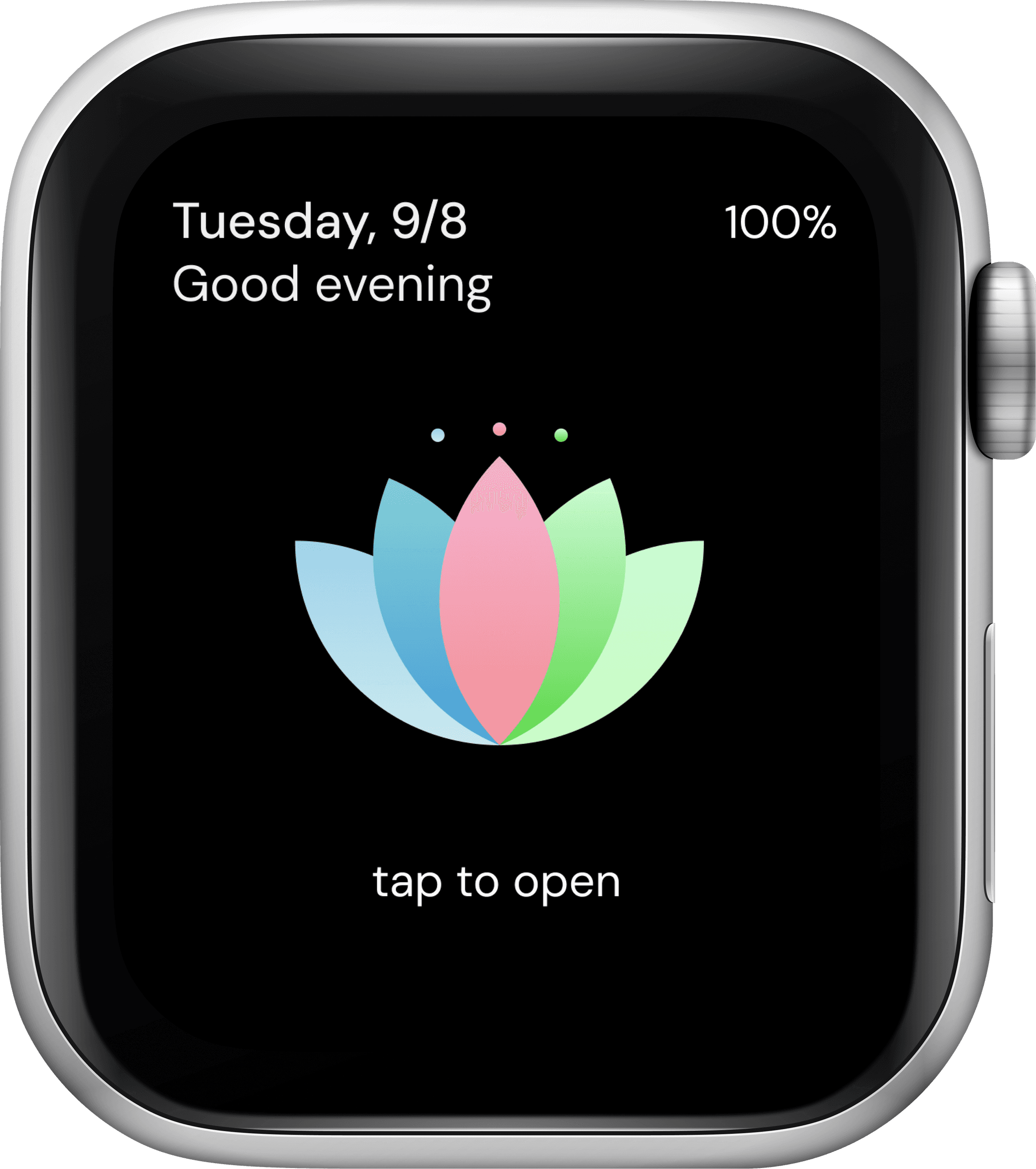
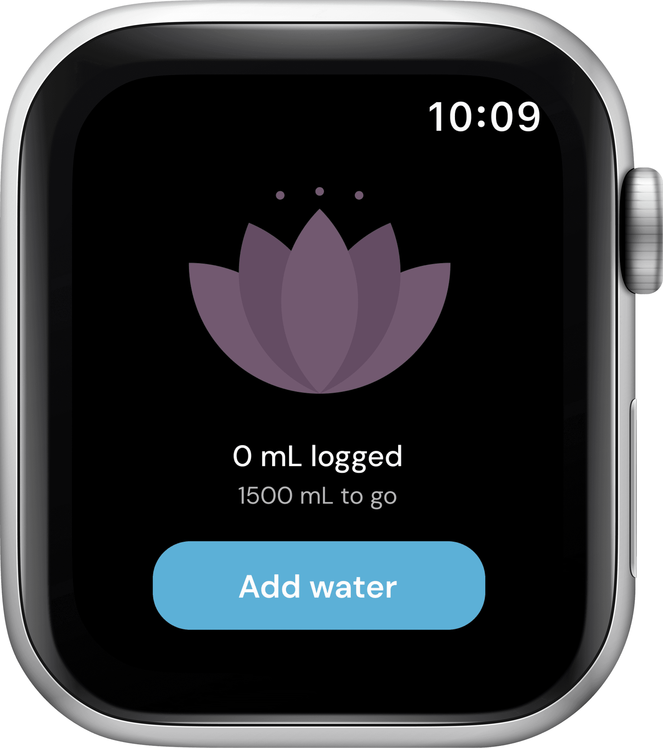
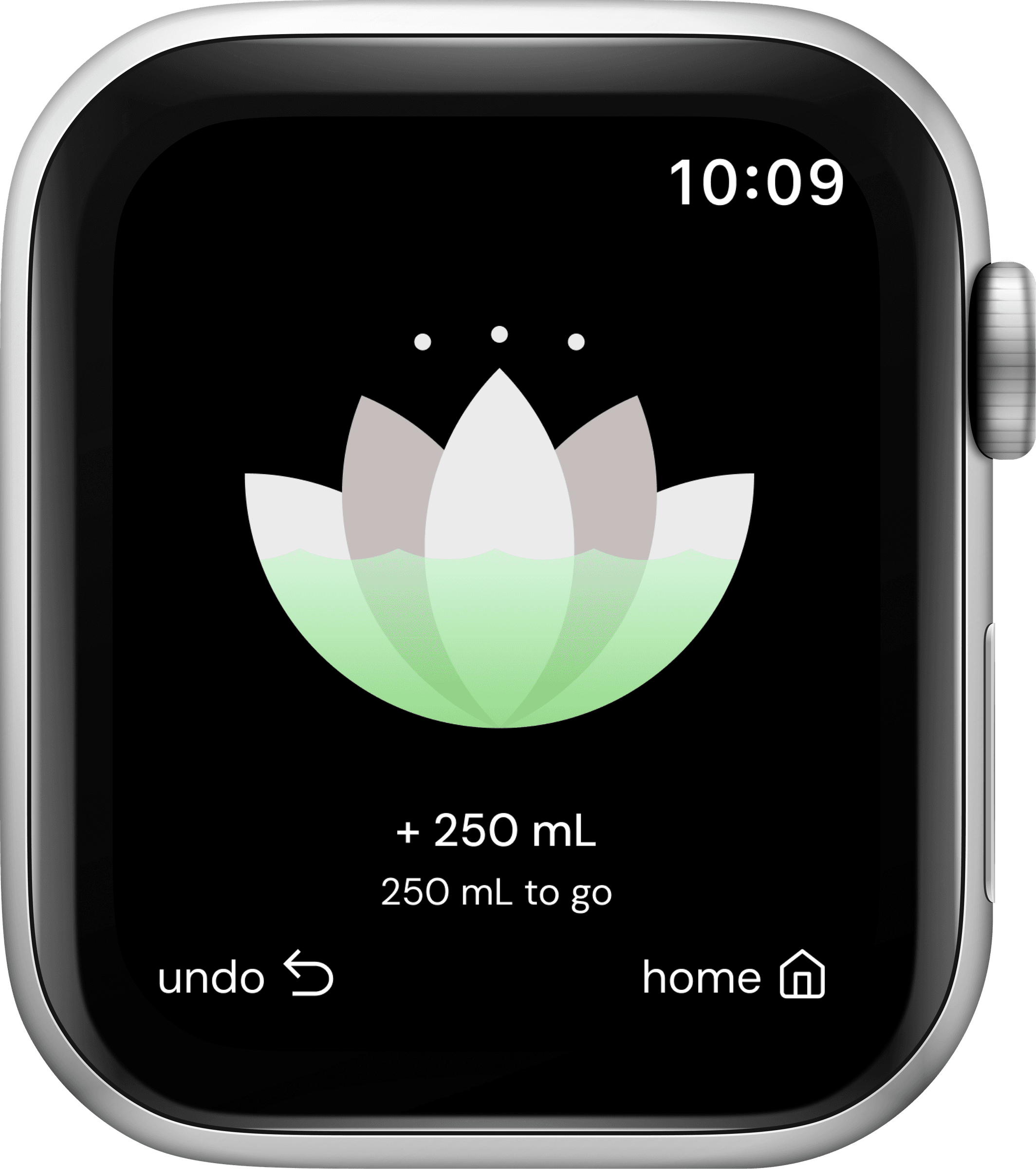
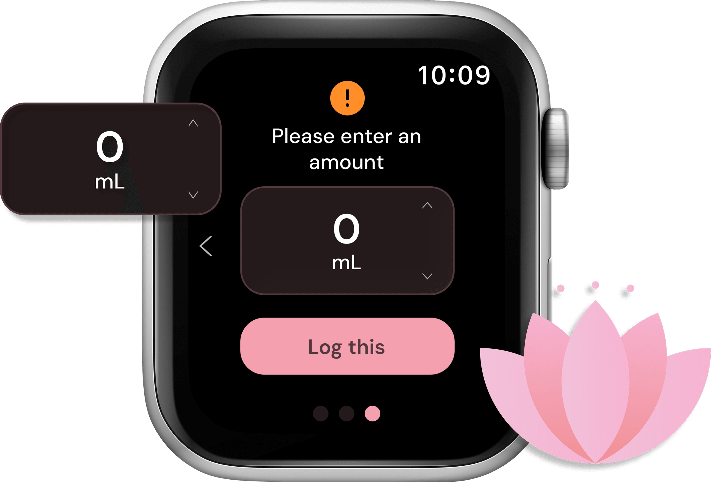
A closer look at the final screens.
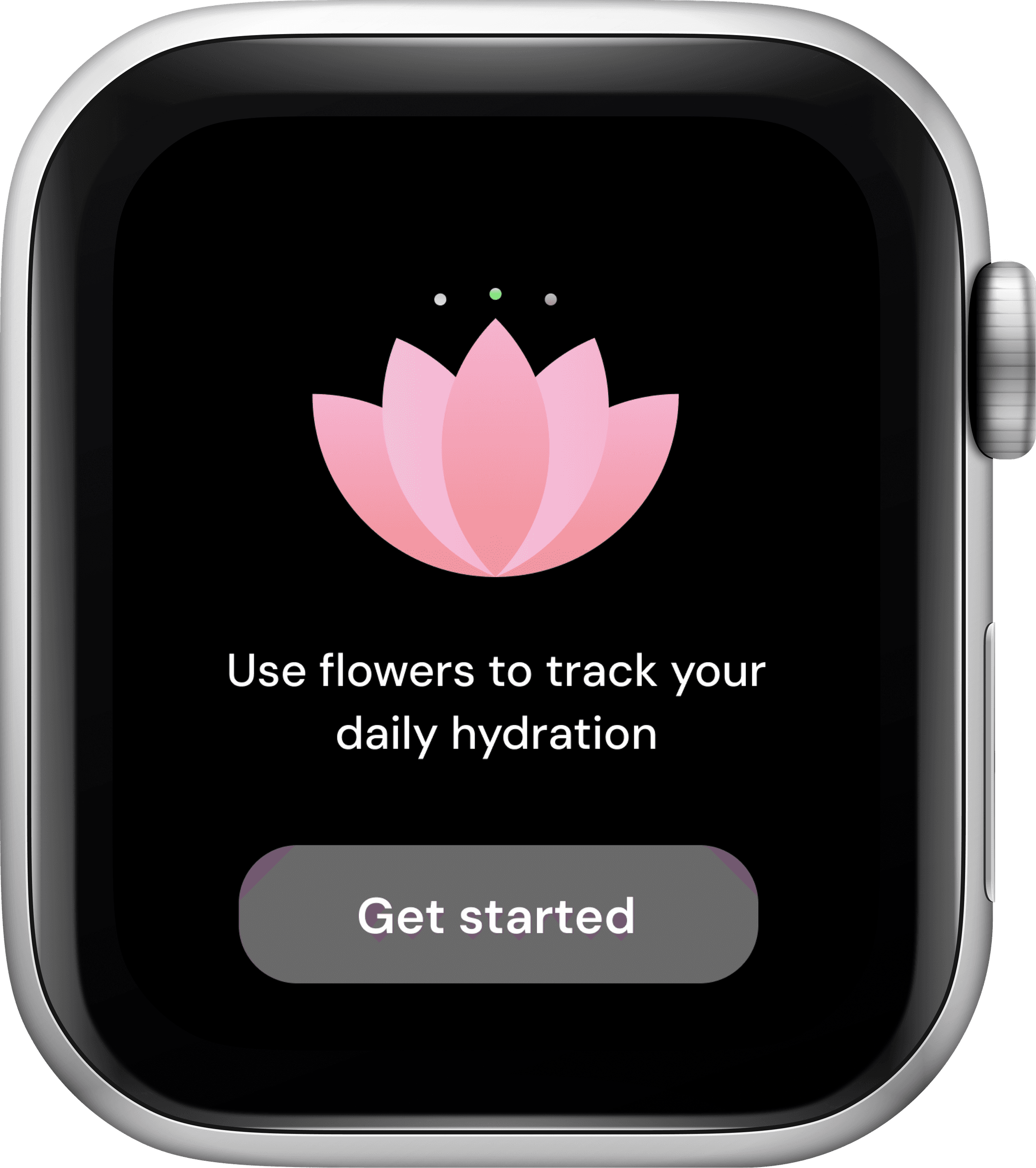
Onboarding
Sets a daily hydration goal to get started.
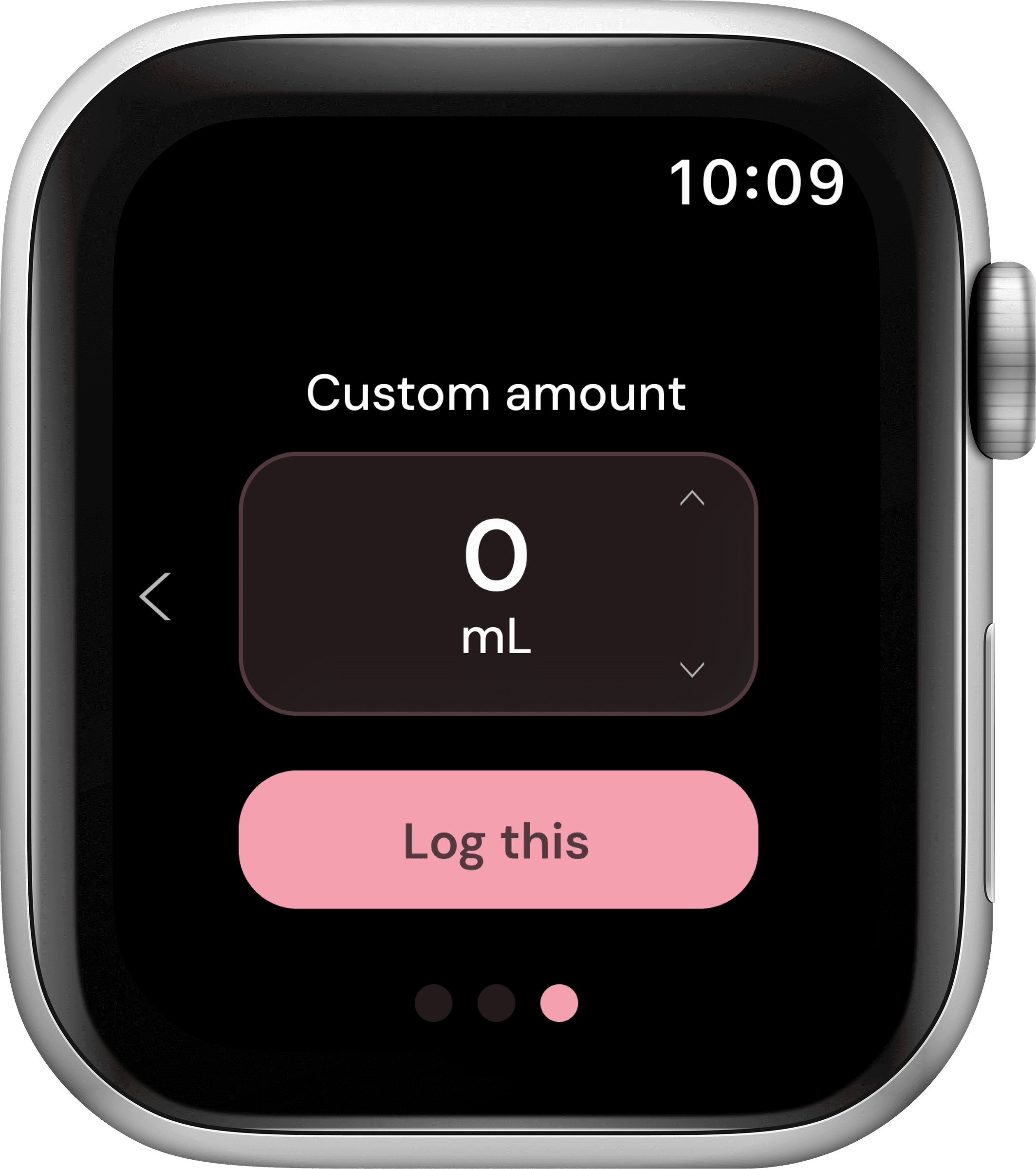
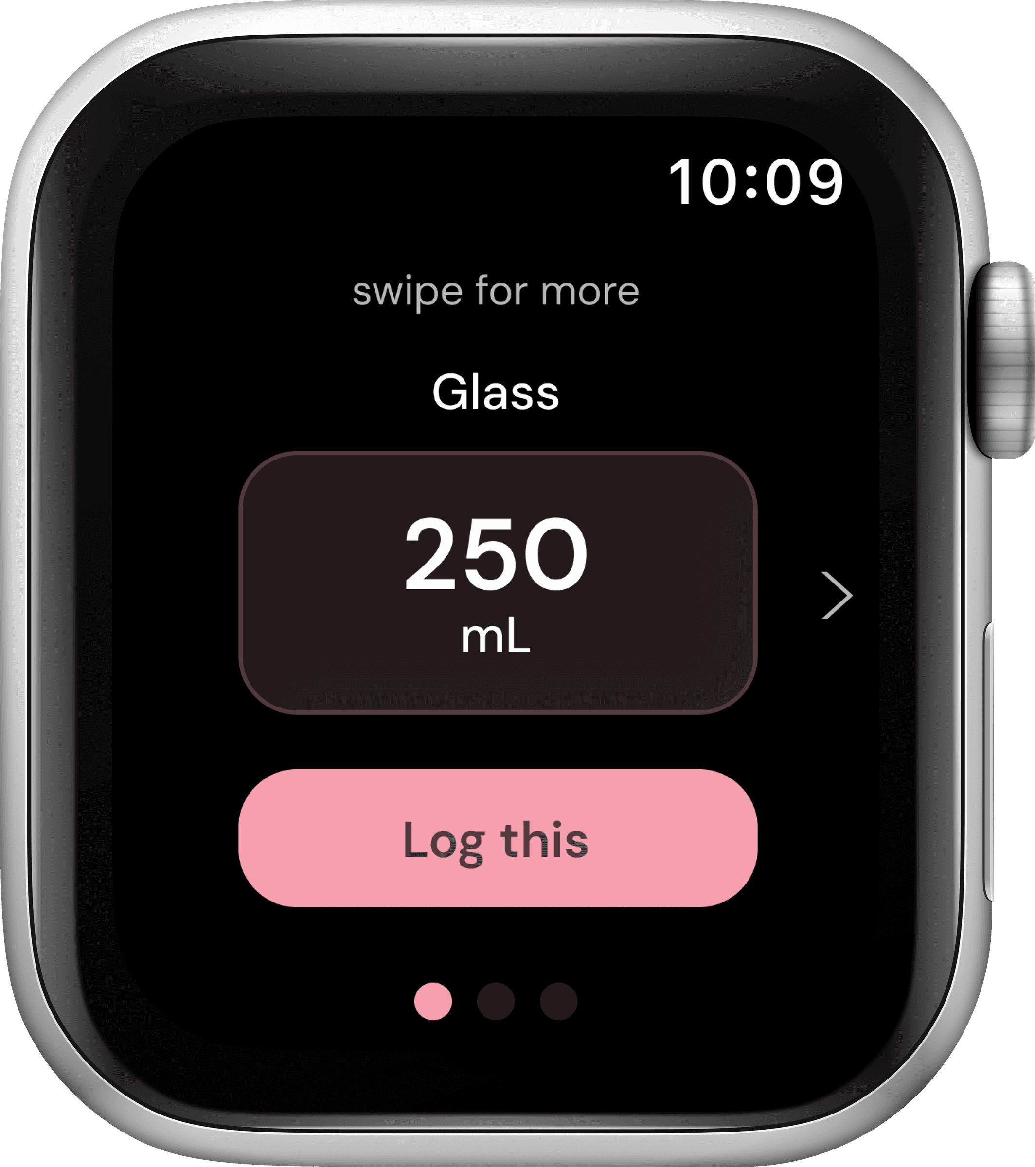
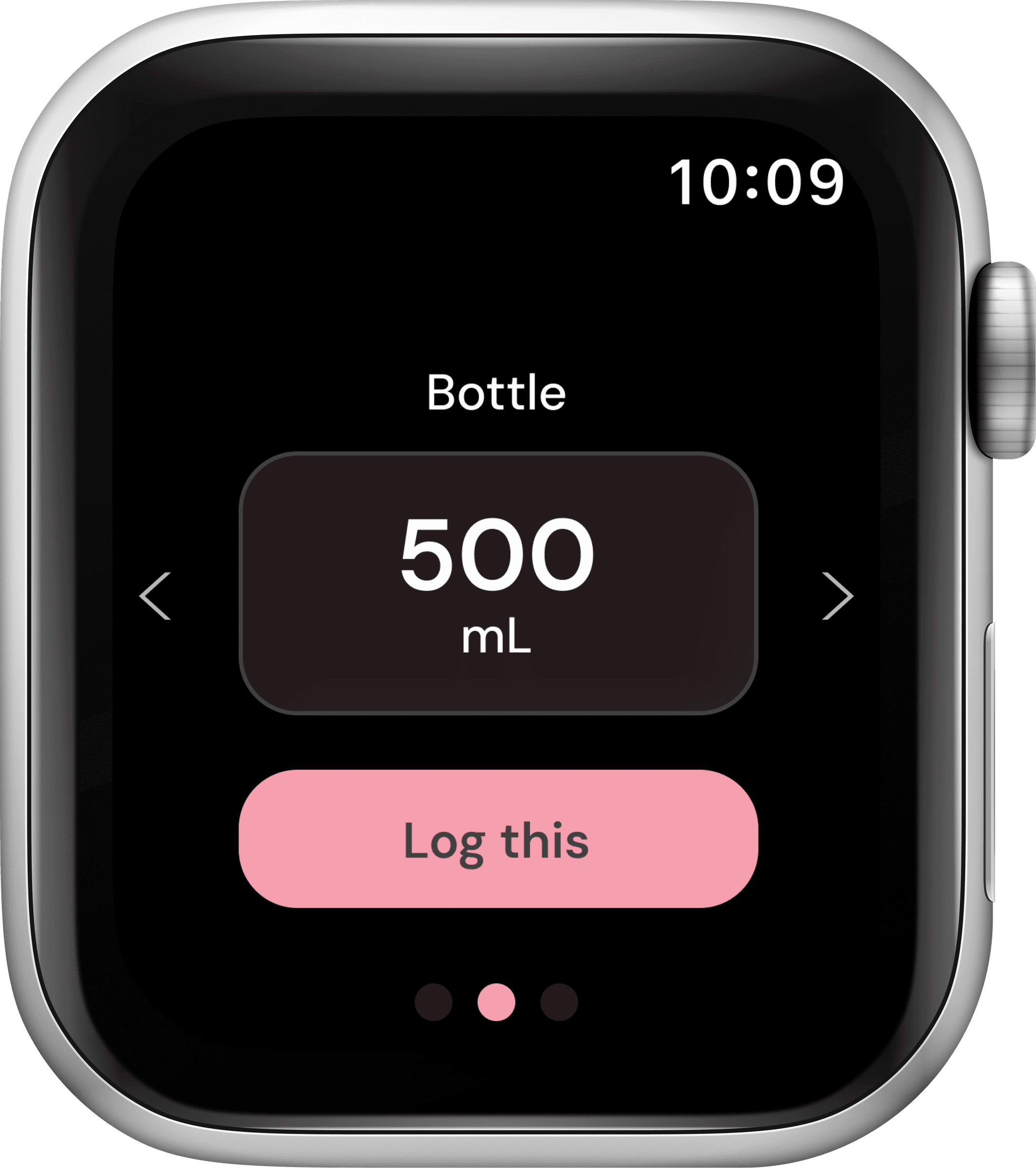
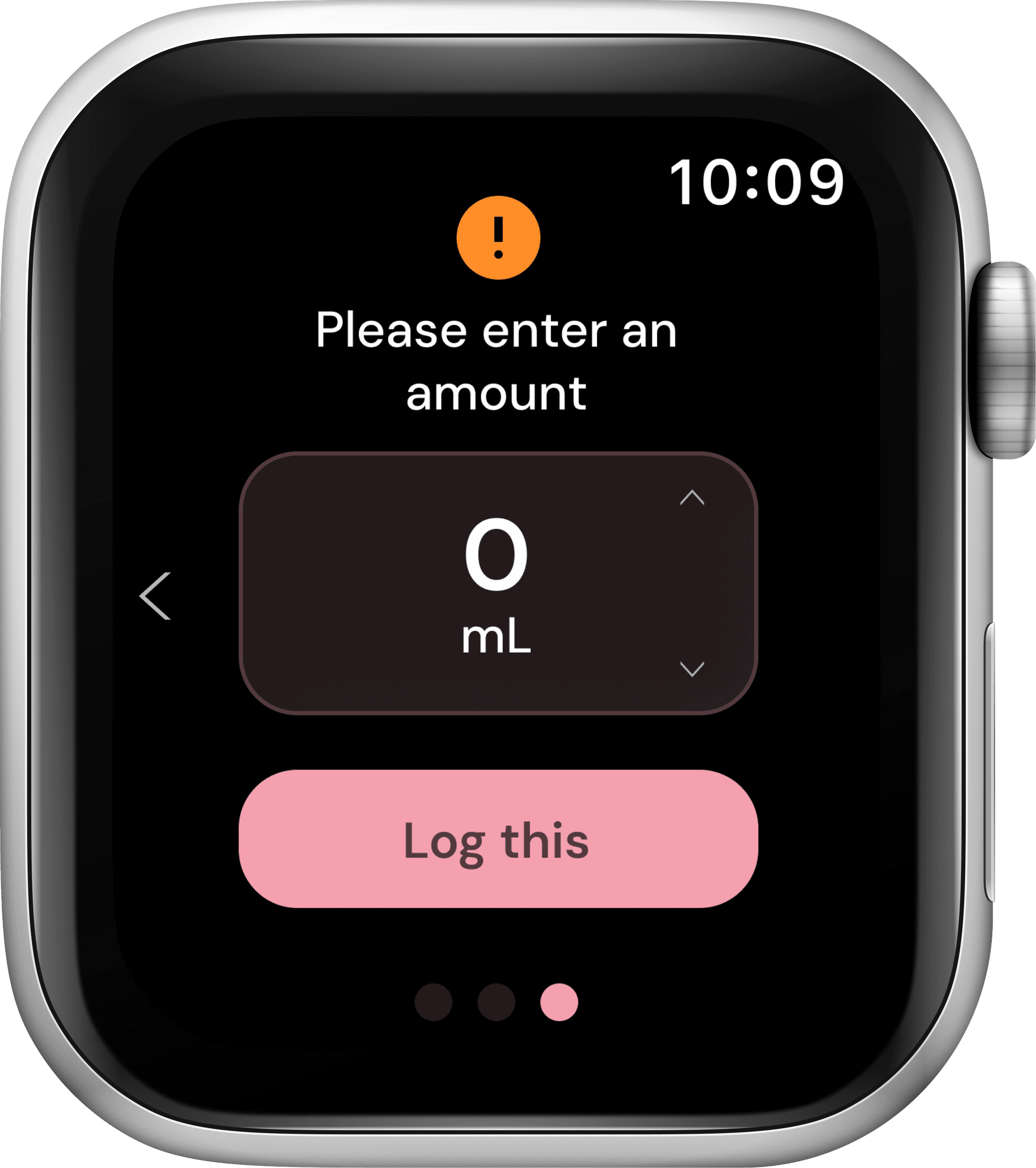
Logging Water
Confirms an amount with one tap.
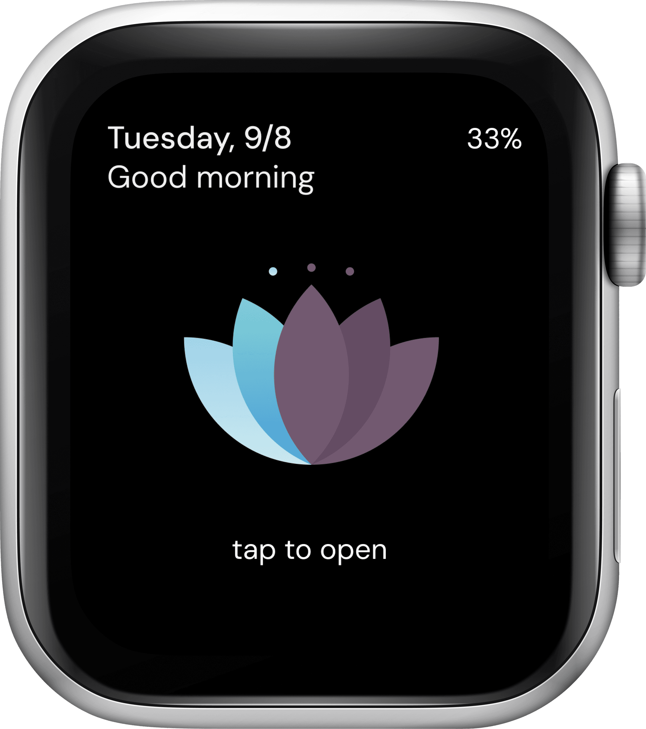
Checking Progress
Glances at the watch face to see where she stands.
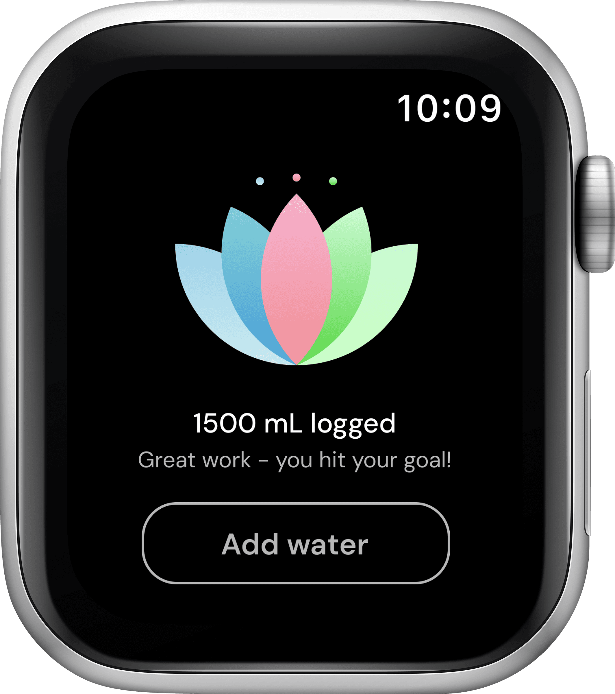
Reaching Goal
A clear moment marks the goal complete.
Every decision ran through one question: does this land in under two seconds.
What worked
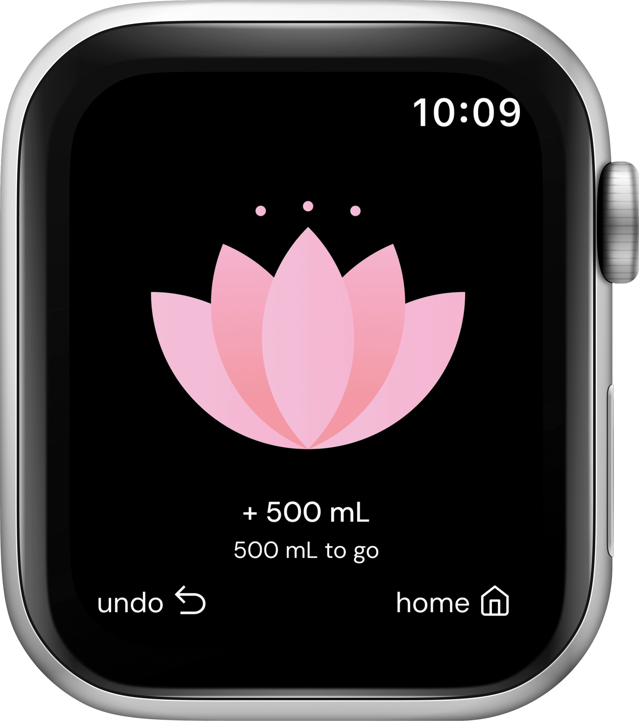
Letting color carry the meaning instead of the numbers. The button tracks progress, the bloom fills the display, and neither one needs a caption to make sense.
What I'd do differently
Bring in a small round of usability testing before locking the flows, even for something this simple. Four research conversations shaped the direction, but nobody had tapped through the actual lotus yet.
What I'd track
How often people open the app and glance instead of digging, and whether the daily bloom holds up as a habit past the first couple of weeks.